ShopDreamUp AI ArtDreamUp
Deviation Actions


Suggested Deviants


Suggested Collections


You Might Like…


Featured in Groups


Description
www.martinstranka.com [link]
meet me on facebook [link]


 My gallery is Copyright ©2007 Martin Stranka. All rights reserved.
All the materials contained in my DeviantART gallery may not be reproduced, copied, edited, published, transmitted or uploaded in any way without my written permission. My images do not belong to the public domain.
Please read the Etiquette Policy and respect it!
Modifying, tubing, cropping, using it for letters or stationeries, copyrighting, stealing my work is not only against the law but unethical.
Altering or using without express written permission is stealing
meet me on facebook [link]
All the materials contained in my DeviantART gallery may not be reproduced, copied, edited, published, transmitted or uploaded in any way without my written permission. My images do not belong to the public domain.
Please read the Etiquette Policy and respect it!
Modifying, tubing, cropping, using it for letters or stationeries, copyrighting, stealing my work is not only against the law but unethical.
Altering or using without express written permission is stealing
Image size
600x600px 145.51 KB
© 2009 - 2024 MartinStranka
Comments317
Join the community to add your comment. Already a deviant? Log In
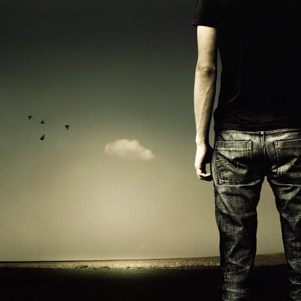
I think this piece is great. The muted tones really bring out the emotion in this piece. This piece really makes minimalism look great. I am a person who loves detail, but there have been a few minimalistic pieces that have caught my eye and, needless to say, this is one of those pieces.
I see that most of your pieces revolve around a central theme which is solitude, for the most part. I have no problems with that, but it doesn't add diversity to your gallery. Probably a theme change would be an interesting change in direction. Not to say that I don't like your work, because I really do love your work. But it would be nice to see something a little different. <img src="e.deviantart.com/emoticons/n/n…" width="15" height="15" alt="
The symmetry of the piece is great. I love how the guy is standing out on the right of the piece, but I think it would have been great to have his entire body in the piece. It would make the viewers see that the person is actually thinking, if that indeed is what you wanted to portray. I think the head of a person is important in any emotive/expressional piece because that's where all thoughts happen. Also, the horizon is straight for the most part, but you can see it slightly angling upwards when it reaches the man's legs.
The lighting and contrast of the piece are great. I really love how the man is sharp and he contrasts great against the gloomy background. The distance between the man and the background is great because it plays with mind-perception. The distance of the birds really played on their size and making them slightly comparable to the single cloud next to them. The piece is definitely aesthetically pleasing to look at and I can definitely feel the emotion from the piece. Keep it up Martin. <img src="e.deviantart.com/emoticons/b/b…" width="15" height="15" alt="